
Conversion-Focused Landing Page
A landing page built as an argument, not a layout
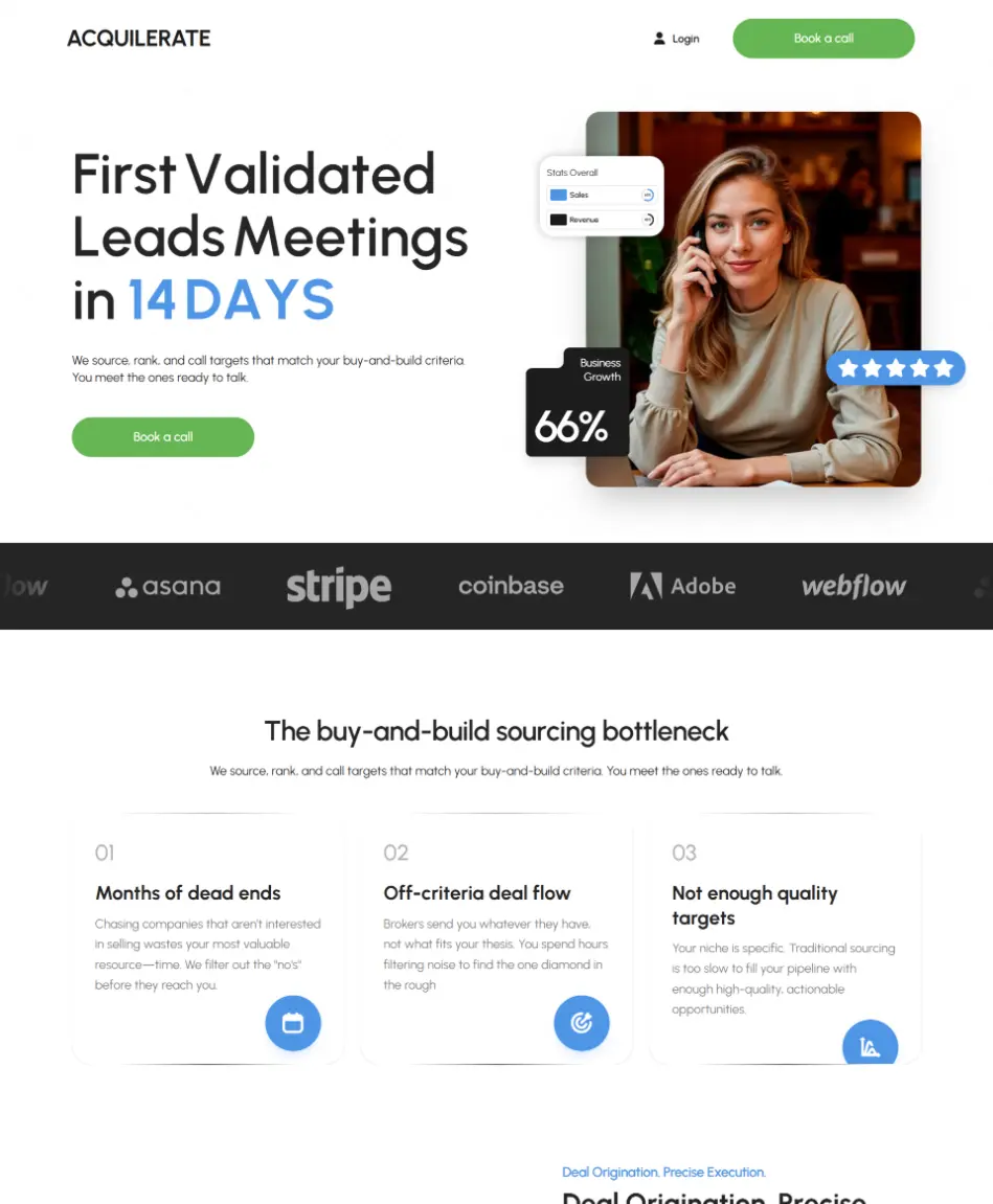
A premium marketing page whose only job is to convert. Landing pages fail for a reason that has almost nothing to do with visual design: they present information in the order the business finds natural rather than the order a sceptical stranger needs it.
- Type
- Conversion landing page
- Role
- UX, front-end build & technical SEO
- Core stack
- React · Tailwind CSS · GSAP
- Focus
- Objection sequencing & page speed
The problem
A visitor arriving cold gives a landing page a few seconds to answer three questions: what is this, is it for me, and why should I believe you. Most pages answer the first, gesture at the second, and never get to the third — they open with a company statement, move to a feature grid, and put proof at the bottom where only people already convinced will reach it.
The other half of the problem is speed, and it is not a separate concern. Paid traffic lands on this page. A slow page burns budget before the argument is made, and the visitor who bounces at 4 seconds is one you already paid for. Conversion and performance are the same line item here.
So the page needed a deliberate sequence of objections, and a performance budget strict enough that the sequence actually gets read.
What I built
A single page in React and Tailwind, ordered around objections rather than around the business, with GSAP directing attention through the sequence.
An objection-ordered structure — each section exists to answer the specific doubt the previous one creates, so the page reads as a conversation rather than a brochure.
Proof placed early and repeatedly — credibility appears before the ask, not after it.
Reusable section primitives — the page is assembled from typed, composable blocks, so testing a different order is a re-arrangement rather than a rebuild.
Technical SEO handled at build time — a real heading outline, resolved metadata, and structured data, rather than tags injected after hydration.
The technical decisions, and why
Structure the page around objections
The section order is the highest-leverage decision on a landing page and the one most often made by committee. Writing out the doubts in the order a stranger has them — and making each section answer exactly one — produces a different page from the usual hero/features/pricing template, and it is the reason the proof sits above the fold rather than beneath it.
GSAP for direction, not decoration
Motion here has one job: control what the eye reaches next, so the argument arrives in order. GSAP earns its place through precise sequencing and scroll-triggered timelines — but the budget is spent only on transitions that carry the reader forward. Anything that merely announces that an animation library is present was cut.
Composable sections over a monolithic page
Landing pages are iterated constantly — a new headline, proof moved up, a section removed. Building from small typed blocks means those experiments are safe and cheap. A page written as one long component makes every test a risk, which in practice means the tests stop happening.
Technical SEO as a build concern
A landing page that also has to rank cannot rely on client-side metadata: the heading outline, the canonical and the structured data have to be in the HTML as delivered. Treating that as part of the build rather than as a post-launch task is the difference between a page that ranks and a page that merely converts the traffic already paid for.
Where it landed
The page argues in a deliberate order and stays fast enough for that argument to be read — which for paid traffic is the whole game, since every second of load time is spend that produced nothing.
The composable structure is what keeps it improvable: headline, order and proof placement can all be tested without touching the surrounding page, so the layout can keep earning after launch instead of freezing at the version that shipped.