
Fern — Administrative Dashboard
A Next.js analytics console that stays readable at scale
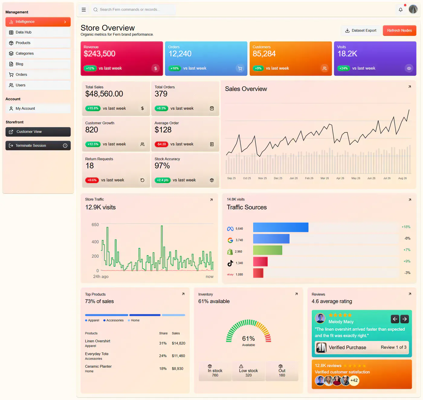
Fern is an administrative dashboard for a commerce operation — revenue analytics, order tracking, customer growth, traffic attribution and inventory in one console. The interesting problem was not drawing charts. It was keeping a dense, data-heavy interface fast and legible as the number of panels grew.
- Type
- Internal admin console
- Role
- Design & full-stack build
- Core stack
- Next.js · TypeScript · Tailwind CSS
- Focus
- Data density, render cost, clarity
The problem
Admin dashboards fail in a predictable way. Someone asks for one more metric, then one more, and each request is individually reasonable. Six months later the operator opens the page and cannot find the number they came for, because everything on screen has equal visual weight and the page takes three seconds to become interactive.
The brief was a console covering five distinct concerns at once — revenue over time, order state, customer growth, where traffic comes from, and what is left in stock. Those are five different questions asked by the same person at different moments of the day. Treating them as five equal panels on one grid would have produced exactly the failure above.
The second constraint was cost of render. Analytics panels want fresh data; fresh data wants client-side fetching; client-side fetching on every panel means a waterfall of requests and a dashboard that flashes empty skeletons on every navigation. That's the trade-off the architecture had to resolve rather than inherit.
What I built
A single console organised by question rather than by data source, built on Next.js with TypeScript throughout and Tailwind for the design system.
Revenue analytics — time-series revenue with period comparison, so a number is always shown against its own history rather than in isolation.
Order tracking — order state with the exceptions surfaced first; the common case is collapsed, the stuck orders are not.
Customer growth metrics — acquisition and retention trends, framed so a change in direction is visible before it becomes a quarter-end surprise.
Traffic source breakdown — attribution by channel, which is the panel that answers "should I keep paying for this".
Inventory management — stock levels with thresholds, the one panel that has to be correct rather than merely current.
The technical decisions, and why
A visual hierarchy that encodes urgency, not symmetry
Every panel got a rank, and the rank drives type scale, colour weight and position rather than being a note in a design file. Exceptions — a stalled order, stock below threshold — are allowed to break the grid; healthy state is deliberately quiet. A dashboard where nothing is emphasised is a dashboard where the operator does the scanning work themselves, every time they open it.
Server components for the shell, client components at the leaves
Next.js lets the boundary between server and client be drawn per component rather than per page, and the whole architecture rests on drawing it tightly. Layout, panel chrome and anything derived from a stable query render on the server and ship no JavaScript. Only the parts that genuinely need interactivity — range pickers, sortable tables, the live-updating figures — become client components. The dashboard's bundle then scales with how much of it is interactive, not with how much of it exists.
TypeScript at the data boundary, not just in the components
The types that matter in a dashboard are the ones describing the shape of the data coming in, because that is where a silent change becomes a wrong number rendered confidently. Typing the fetch boundary means a shape change is a build failure. Typing only component props means it is a support ticket.
Tailwind as a constraint system rather than a shorthand
Data-dense UI degrades fastest through drift — one panel at 13px, the next at 14px, three greys that are nearly the same. Working inside a fixed scale of spacing, type and colour removes the decision entirely, which is what keeps the twentieth panel looking like the first.
Where it landed
The console reads as one instrument rather than a collection of widgets: the ranked hierarchy means the number you came for is where you expect it, and exceptions announce themselves instead of waiting to be found.
The server/client split is the decision with the longest tail. Because interactivity is opt-in per component, adding a panel adds render work roughly in proportion to that panel — not to the page — so the architecture holds up under exactly the incremental-request pressure that degrades most admin tools.