
Ausport — Creative Director Portfolio & Template Store
A portfolio that has to sell two different things
Ausport is a creative director’s personal site — the work, the career, the pitch for a commission. It also sells finished UI templates for the price of a lunch. Those are two conversion events with wildly different stakes sharing one scrolling page, and the design problem was letting the cheap one exist without cheapening the expensive one.
- Type
- Portfolio & template storefront
- Role
- UI/UX design & front-end build
- Core stack
- Next.js · TypeScript · Tailwind CSS · GSAP
- Focus
- Type system, motion budget, dual conversion
The problem
A designer’s portfolio is the one site where the craft is not evidence for the argument, it *is* the argument. Nobody reads a creative director’s case studies and then decides separately whether the person can art-direct. The page itself is the audition, which means the usual failure — a competent site assembled from competent parts — is fatal here in a way it would not be for a SaaS landing page.
The second problem is that this site has a second job. Alongside the direction work it sells finished UI templates outright, at prices low enough to be an impulse. Put those cards front and centre and the site reads as a shop, which quietly reprices the person selling it. Bury them and the revenue line does not exist. Both failures come from treating the two offers as one funnel instead of two.
And the brand rests on a handwritten script display face — the thing that makes the page look authored rather than assembled, and the thing that becomes unreadable the moment it is asked to carry a paragraph. A type system built on a face that only works large has to answer what everything small is set in, before a single section gets laid out.
What I built
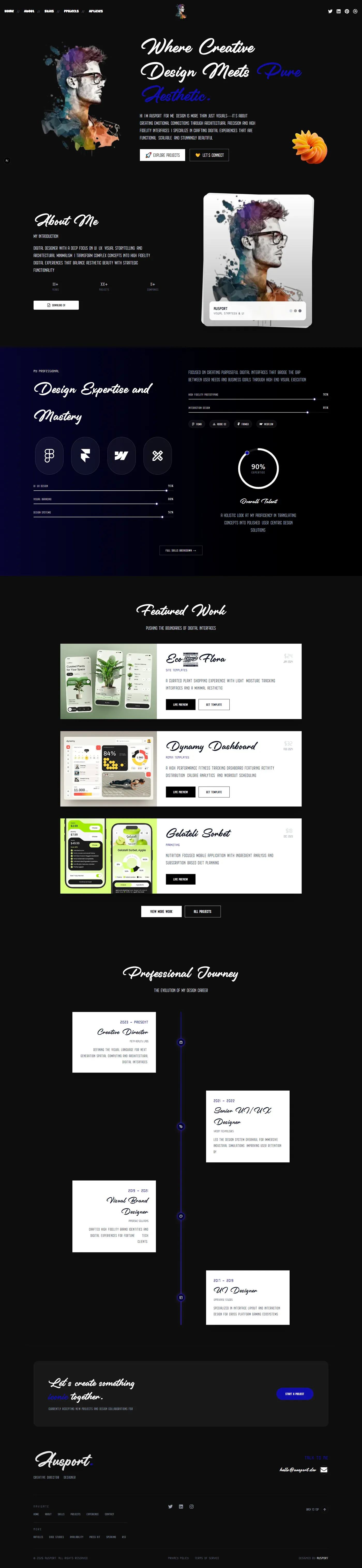
A single long-scroll page on Next.js with TypeScript throughout, Tailwind holding the type and colour system, and GSAP driving the sequences that are genuinely scroll-linked.
A two-register type system — the script display face for headings and the wordmark, a small wide-tracked uppercase sans for every other run of text, and no third option anywhere on the page.
A near-black canvas with a single indigo break — the expertise section is the only value shift in the whole document, which is what makes it read as the spine rather than as one more panel.
A proficiency section that shows rather than lists — scroll-linked skill meters, the tools set as marks instead of logos in a row, and one radial figure summarising the rest.
An alternating career timeline — four roles staggered either side of a centre rule, so the progression is legible as a shape before any of it is read.
Priced template cards — each with its preview, its specification and its own two-button footer, so buying is a local decision made at the card.
A closing commission section — the hire-me ask given a full-width band of its own at the end of the page, with nothing beside it to choose instead.
The technical decisions, and why
Two type registers, and a hard rule about where each may appear
The script face is allowed above a size where its ligatures actually resolve, and nowhere else; everything below that is the tracked uppercase sans. A display face used once is a signature, used twice a motif, used everywhere a legibility bug — and the drift happens gradually, one tempting subhead at a time, which is why the rule is a fixed pair of Tailwind scales rather than a note in a design file. Headings stay real text with a sans fallback stack behind the webfont, because the cost of setting them as images is that the most important sentences on a designer’s site become invisible to search and to a screen reader.
Value does the sectioning, so borders do not have to
The page separates its sections by shifting the ground — near-black for most of the document, one indigo field for the expertise block — instead of by rules, cards and containers. It costs nothing to render, it holds the eye at the one place the page most wants attention, and it survives the narrow breakpoint, where borders and card chrome start eating the gutters and every section ends up looking like a widget.
A motion budget assigned per section rather than to the page
GSAP is real weight, so it only does what CSS cannot: the meters and the radial figure that fill in step with the scroll position, and the timeline’s staggered entrance. Hovers, fades and the small ambient movement stay in the stylesheet. Under a reduced-motion preference the meters render at their final values rather than animating up from zero — the number is the content, and a preference for less motion is not a request for less information.
Client islands drawn around the motion, not around the page
GSAP needs a live DOM, and the easy version of this is a use client at the top of the page, which hands the entire tree to the browser to hydrate. Instead each animated block is its own client island inside a server-rendered page: the copy, the timeline entries and the template metadata render on the server and ship no JavaScript, and only the animation controllers hydrate. It is the difference between a portfolio that animates and a portfolio that animates and is still a fast, indexable document underneath.
Prices shown in the open, and the commission kept somewhere else
The templates carry visible prices and a live preview beside the buy, because hiding a small price turns a low-friction purchase into a quote request and kills it. The visible price also does something for the other offer: it marks which things are off-the-shelf, so the direction work reads as bespoke by contrast rather than by assertion. What the two must never do is share a row — the commission ask gets the last full-width section on its own, so a visitor who arrived to hire someone is never handed a cheaper thing to click at the moment of deciding.
Where it landed
The page reads as authored rather than assembled, which for someone whose business is design is the whole proof. The type pairing is doing most of that work, and the fact that it is exactly two choices held everywhere is why it still looks deliberate at the bottom of a very long scroll.
The transferable decision is the island boundary. Motion is what makes this site feel directed, and drawing the client boundary around each animated block instead of around the page is what stops that feeling from being paid for in hydration cost and lost indexability. A portfolio that animates beautifully and ranks for nothing has failed at the only job it has.