
Learn by Build — Online Learning Landing Page
An early practice build: a landing page for learning by doing
Learn by Build is one of the first projects I built when I started out. It is a landing page for an imagined learning platform where students learn by building real projects. The aim was to practise turning a bold design into clean, reusable components, not to ship a finished product.
- Type
- Practice project · landing page
- Role
- Design & front-end build
- Core stack
- Next.js 16 · React 19 · TypeScript · Tailwind CSS v4
- Focus
- Layout, components, visual design
The problem
Early on, it is easy to build pages as one long file where every button and badge is styled by hand. The page looks right once, but every change means finding and fixing the same styles in several places.
This project was a chance to practise the opposite: take a busy, colourful design and build it from a small set of shared parts, so the page stays consistent as it grows.
What I built
A Next.js 16 App Router site in TypeScript, styled with Tailwind CSS v4 and two custom display fonts, and deployed on Vercel.
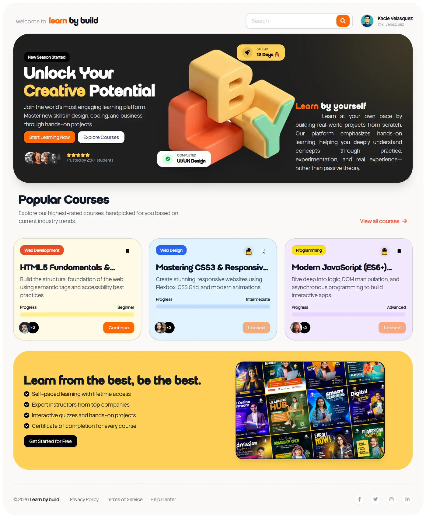
Hero: a dark panel with a bold headline, two calls to action, student avatars with a rating, and a 3D “LBY” illustration with floating streak and “completed” cards.
Popular courses: three colour-coded cards for HTML, CSS and JavaScript, each with a category badge, difficulty level, progress bar and a Continue or Locked button.
Promo section: a yellow block with the platform’s benefits as a checklist and a sign-up button.
HTML reference page: a searchable list of HTML guides and elements, with deprecated and experimental elements clearly marked.
The technical decisions, and why
Shared buttons and badges
Buttons and badges are built once with class-variance-authority, with variants for style and size, and a small cn helper merges extra Tailwind classes safely. Every button on the page comes from the same component, so a style change happens in one place.
Course cards driven by data
The course cards are rendered from an array rather than written out three times. Each course names its colour theme, and lookup maps turn that name into the card background and progress-bar colours, so adding a course means adding one object.
Search over a typed list
The HTML reference page keeps its content in a typed array of sections and items, each with an optional status. The search filter is memoised with useMemo, so typing only re-filters the list instead of rebuilding the page.
Where it landed
The landing page is live and matches the design closely on desktop. As a first project it is simple: the courses and students are placeholder content, and there is no sign-in or real course behind the buttons.
The main lesson was to build shared components first. It made the page quicker to finish and is the habit behind every later project in this portfolio.
Built with
Related work
Evro AI — B2B SaaS Landing Page
A React 19 and Vite landing page for an AI coaching startup: a header that follows the section colour, a pausable autoplay slider, and copy kept in typed data files.
Conversion-Focused Landing Page
A conversion-focused landing page in React, Tailwind and GSAP — structuring the page around objections, and the technical SEO built in at build time.